


인기 게시판 TOP 50
[All]
Mungyeong City logo that changed after 20 years.jpg
2024.06.05 23:03
Anyone could see that it was Mungyeong Saejae.
Anyone can see that it is a new village credit union
Comments47
Popular in Free Board
Ranked by comments, likes, and saves from the last 24 hours
Ranked by comments, likes, and saves from the last 7 days
Ranked by comments, likes, and saves from the last 30 days
- 02CommentsThe song was so good that I was completely hooked the whole time I was listening. I’m adding my support as well.210026.11.06
- 03CommentsThat is such a touching story. Roy Kim had a great voice, but that participant's voice is also really good.1170026.11.03

- 01CommentsIt's been a while since Yook Sungjae had a fan meeting. He seems to be having fun with the fans.630026.11.04
- 02CommentsWow, that's amazing haha. It's overwhelming, so cool.1010026.11.03
- 03CommentsSo you've unveiled the performance of your new song. It's been 7 years since you appeared on a music show.980026.10.31


- 01CommentsI look forward to seeing the trainees take on the challenge of pursuing their dreams again! I am rooting for them to achieve great results and debut this time!1660026.10.17
- 02CommentsI don't think it's quite right for me yet. I can't really trust things that have no substance.1350026.10.16
- 03CommentsSo they didn't deliver in plastic containers back then. I've never ordered sundaeguk, so I wouldn't know.1200026.10.16


- 04
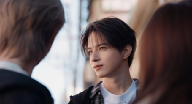
Recently concluded masterpiece youth drama.jpg[21]
870026.11.03
- 05
The song Roy Kim reportedly wrote to play for his future wife… jpg[21]
1170026.11.03
- 06
- 07
- 09
- 10
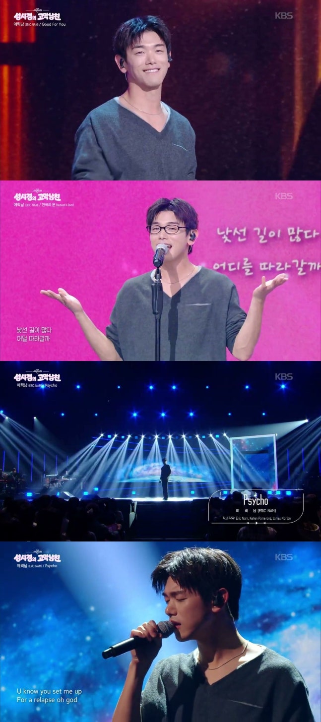
Eric Nam photos from the October issue of Esquire[20]
870026.10.31


- 04
Ryu Hye-young, who filmed her first horror movie.jpg[30]
1260026.10.16
- 05
Songs that will still be listened to in 2026, more than expected[30]
1020026.10.16
- 06
- 07
- 08
It's surprising to hear that Kim Jong-min is becoming a dad.[28]
960026.10.15 - 09
A cover stage by a female idol who is a perfect fit for every genre[27]
1200026.10.20
- 10
Eric Nam's new music video that gathers all the psychos from movies[27]
1790026.10.16


