※This is just my opinion.
!Today's feedback piece!
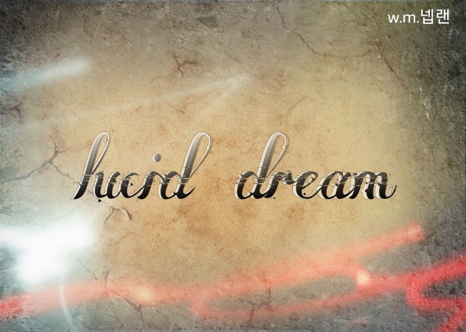
Once I received this piece
I didn't know what it represented
Since it's cursive, I thought the R part was h
Okay, I got it 🤣
In the case of a cover with only a title, the title is handwritten
It's a bit uncomfortable to look atㅠㅠ
Also, you put in too many points
Rather, it gives a messy feeling
In particular, the effect you put in the middle of the text looked very messy.
What kind of atmosphere is it above all else?
There is no way to guess what the word means.
The cover is made by reducing and condensing the work.
So I

I made it like this :-)
It's handwritten, but it's somewhat readable.
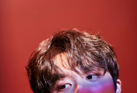
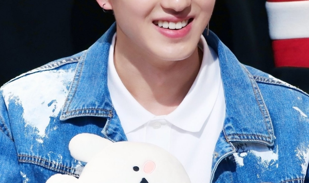
And I chose matching photos and matched them :-)
The title is eye-catching
Please use a photo that matches the title or content.
I think it would be good!