※This is just my personal opinion.
*Today's Cover*
Problem 1
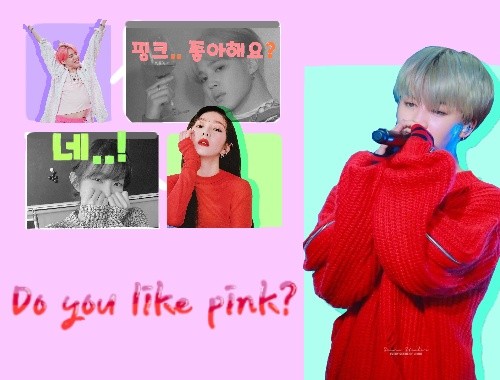
The color is a problem overall.
If it's pink, it's not pink
A color that matches with about 3 shades of pink
It's easier to see if you match them
(example
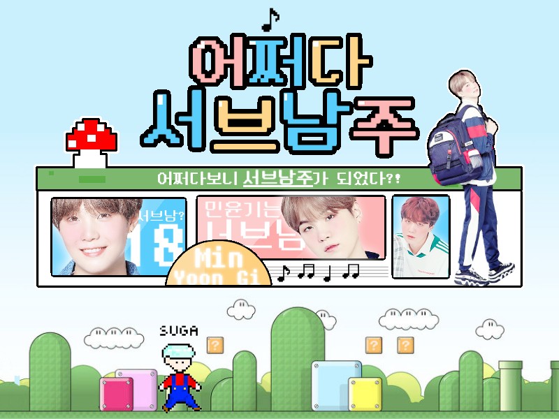
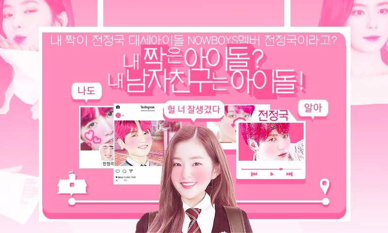
This sign is purple, blue, and green
The basic base and core color of this cover
It's made up of mismatched colors
furthermore
The title is red-pink
The background is a purple-pink color, so it doesn't match.
Red series pink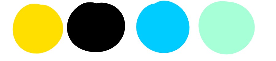
Goes well with these colors
If it's a purple pink,
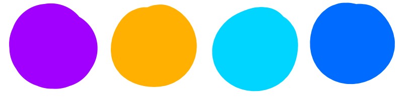
These colors go well together~
(Both white suits
(This is my personal color combination)
If you want to make it colorful
Base in white
It's safest to leave it alone.
Second problem
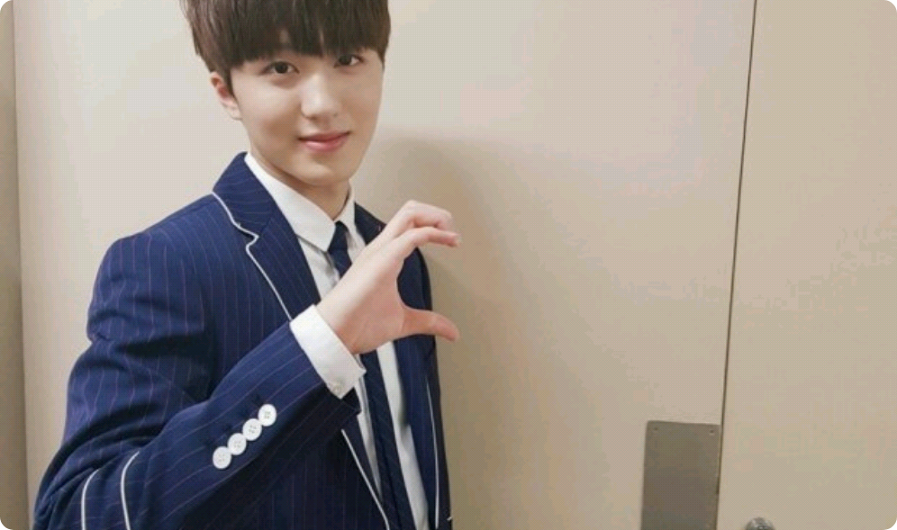
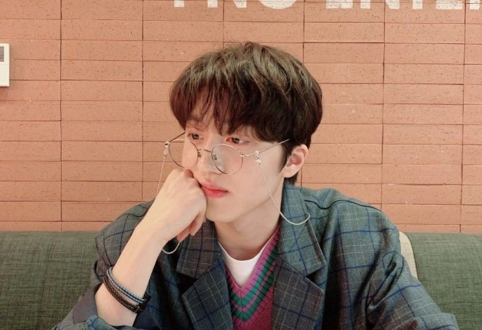
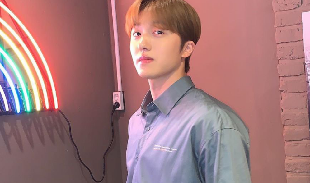
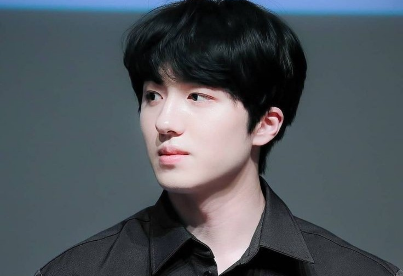
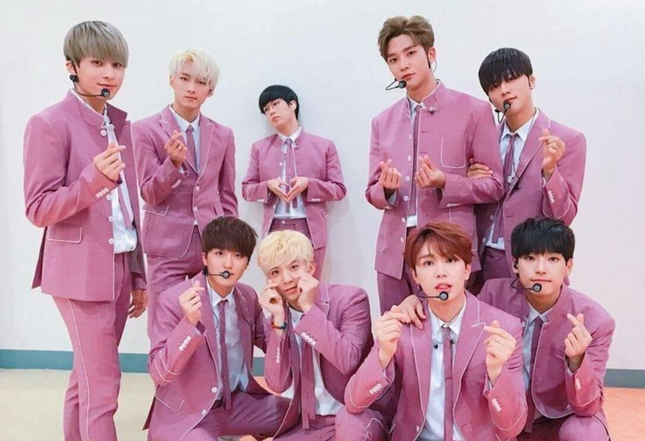
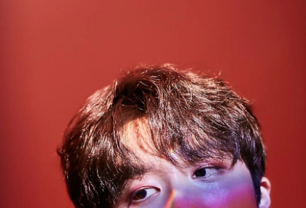
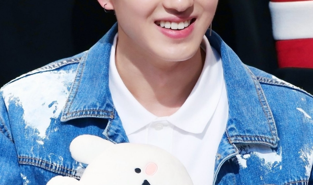
This photo and

This picture
It doesn't suit me at all.
(I'm really sorry if this was intentional)
Of course, unity doesn't have to be invincible.
Depending on the character's personality and lines
I need to insert a photo
(yes
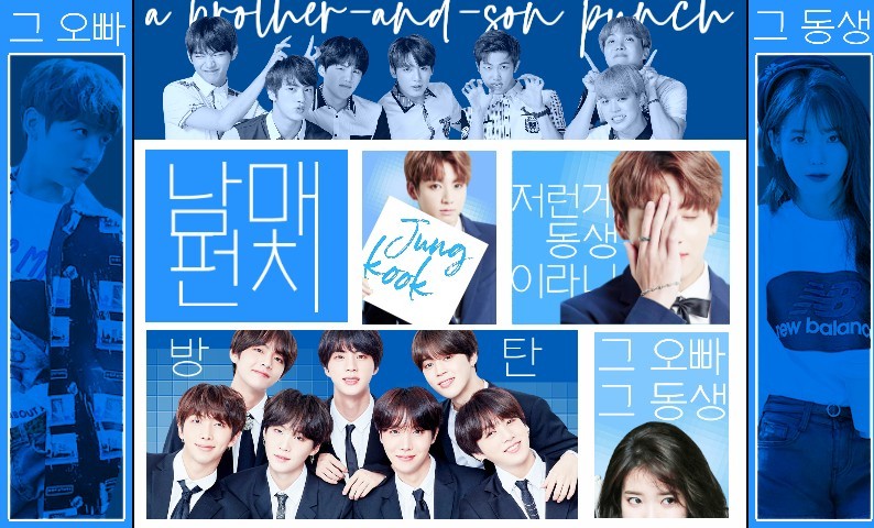
Problem 3
If you put the title somewhere that doesn't seem to be a corner,
There may be a lot of empty space, so it may look boring.
The title is in the center or a complete corner
It's like putting a puzzle together on a tightly packed cover.
I like it the best
(yes
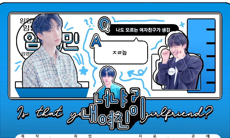
n In the middle
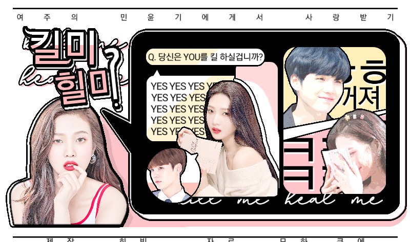
N corner
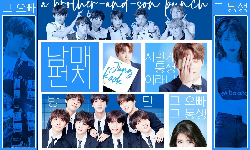
Fit it together
Chit-chat
Hello everyone'♡'
This is Hee-bin.
I decided to change the way I give feedback!
I think there should be some kind of example by now.
I made a new cover
Come to think of it, I'm not the one who gives feedback.
I'll let you know what needs to be fixed
It's a role that helps develop based on that.
So now we're going to proceed with this type of feedback.
Please understandㅠㅠ
Oh right, it hurts so take some medicine and rest for about an hour~~~
Johnny got better'♡'

Go to the nkanshik workshop><