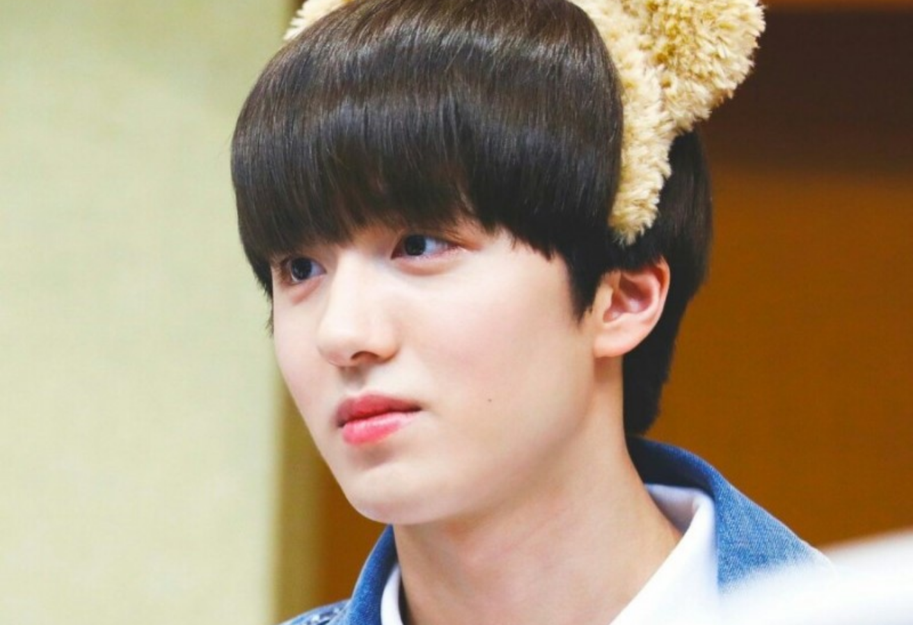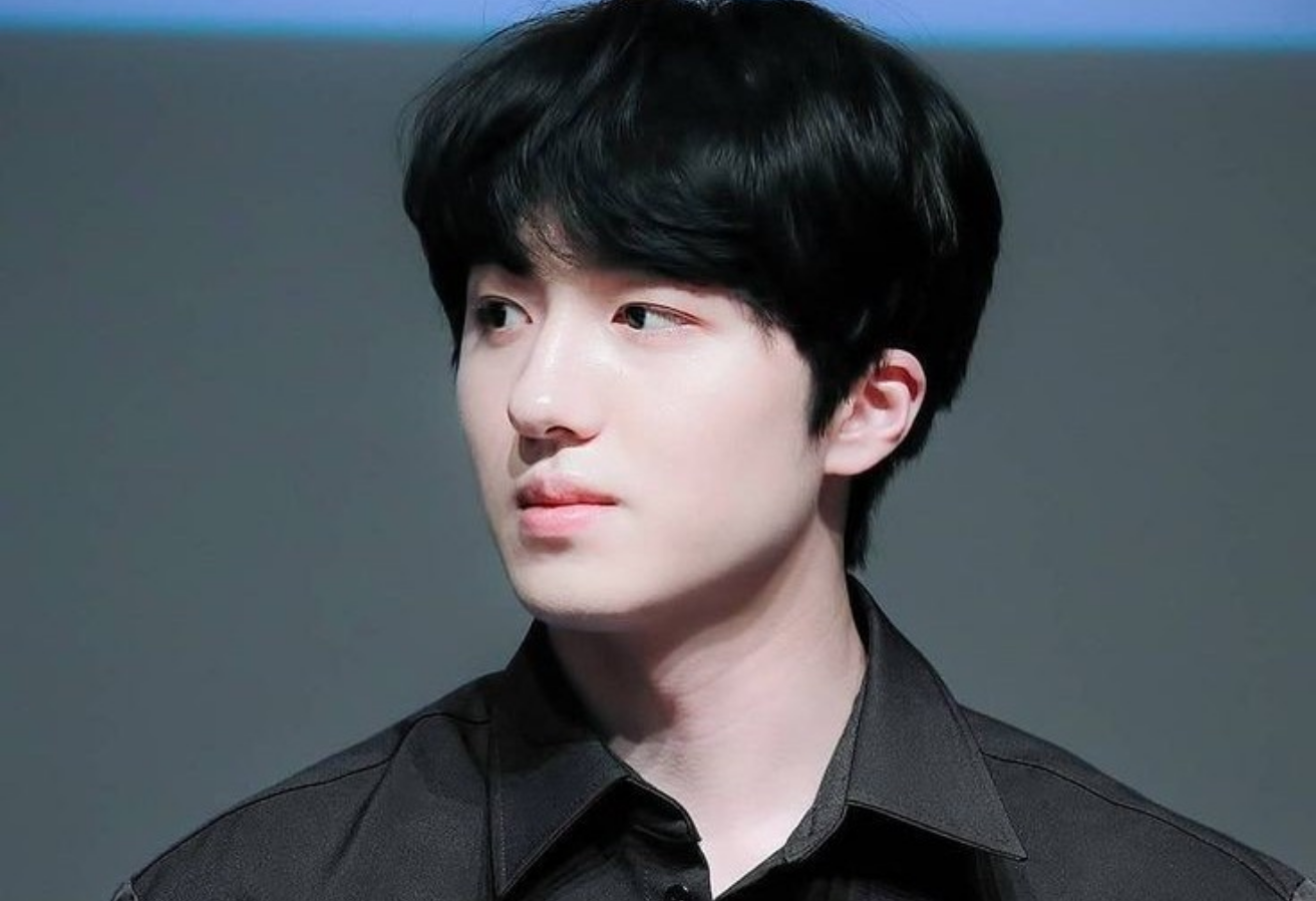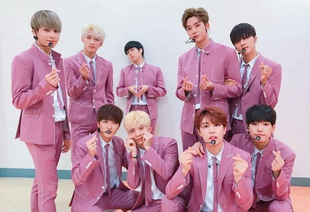
Hello, this is Heebin~
I have a special feedback
I prepared a Kkanhyeonsik version^^
(Actually, that punk threatened me!!!!)
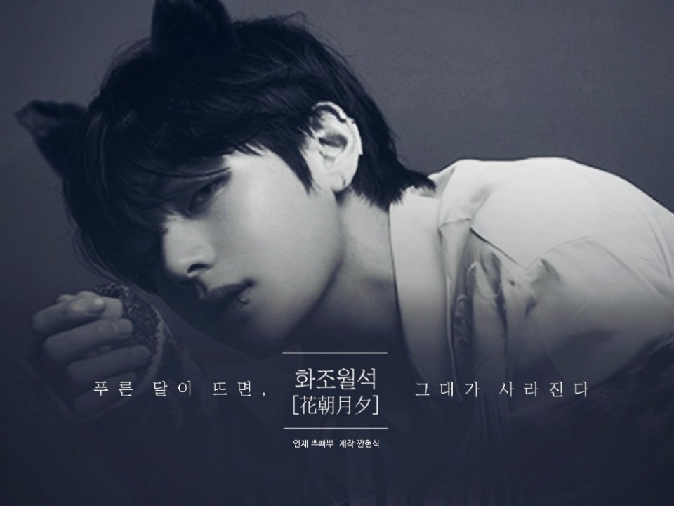
First of all, looking at the cover, the title design and
The photo composite turned out well
I think the title is too high up
The transparency of the title and subtitle are the same
My gaze is scattered
So what I made was
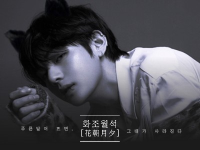
This is it
The image quality is a bit off because I have a different app ㅠ^ㅠ
First of all, it seems like a closed atmosphere.
I used a correction method that makes the gloss stand out even more!
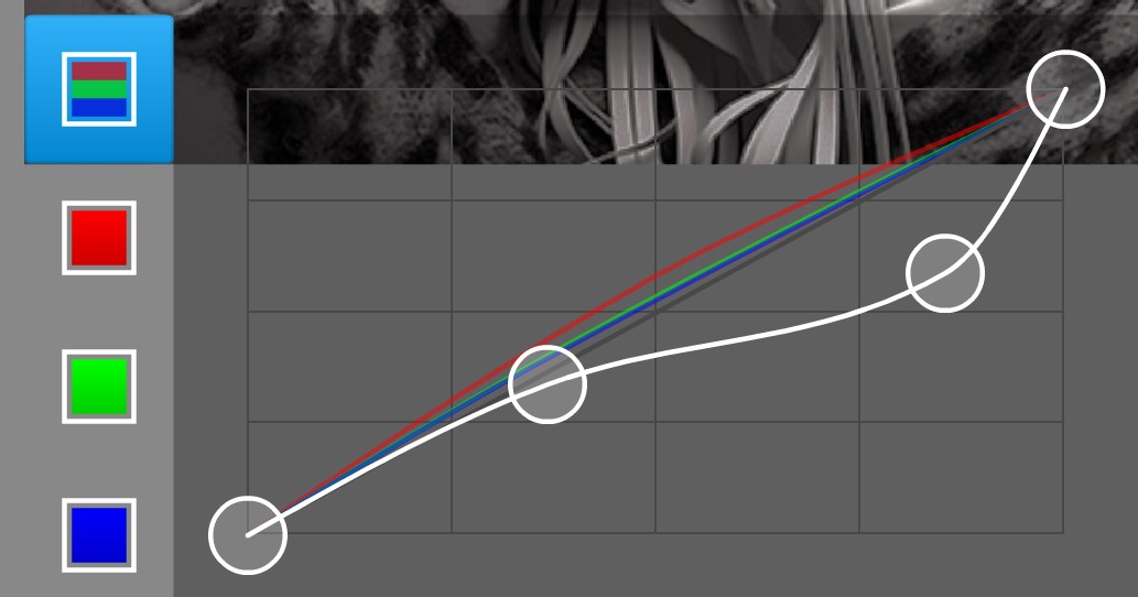
How to correct (Photoshop Touch)
There is a blue moon, so it has a blue color.
I tried adding more
As I said, put the title and subtitle below.
I adjusted the transparency
Hyunsik is older than me and has more experience than me, so what can I say?
There's not much;;