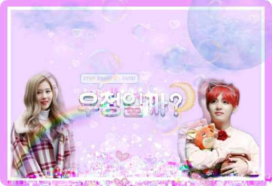

I tried making it in the style of a cover I usually make. The sky looked a bit empty, so I composited it in, and I also placed the subtitle on top with a pale white background. I tried to make the editing feel as nostalgic as possible, but I don't think it came out well. I painted the back of the title with a watercolor brush to make it more visible, and I wanted to emphasize the word "happy ending," so I changed the font to Gothic. And since it's a happy ending, I included a smiley face.

I wanted to make this look like a book cover, so I changed the logo to something clean and simple. I roughly adjusted it by putting text in a small white square and adding a larger dark blue square outside of that square, and it turned out okay. However, I'm a little disappointed that it doesn't match well with the photo.

Personally, I like this one the cleanest. It's made to feel like a book cover, and I just recolored the background with the same logo as above.
Overall, I wanted to give it a very blue feel. Something like the ocean or blue? Keywords would be "youth, ocean, blue, sky." I can't say I like it.