
I guess it's a bit difficult to go straight into practice.
After much deliberation, I chose the Ibis Yame mockup...kekekekeke!
[Before we begin, what is a mockup?]
See it first, not just read the description!
This is what we call a mockup.
If you type in the green box, corn will come out, so just refer to it.
Let's dive right in!
1
Prepare materials
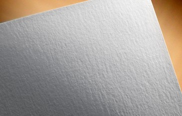
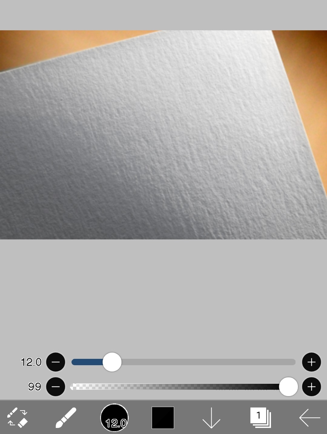
I will use this material.
If you don't have it, please capture it and use it or search for it and download it!
2
Insert Ibis text
Likewise, go into Ibis
This time, without creating a canvas
Import photosI'll use it to call up the photo.
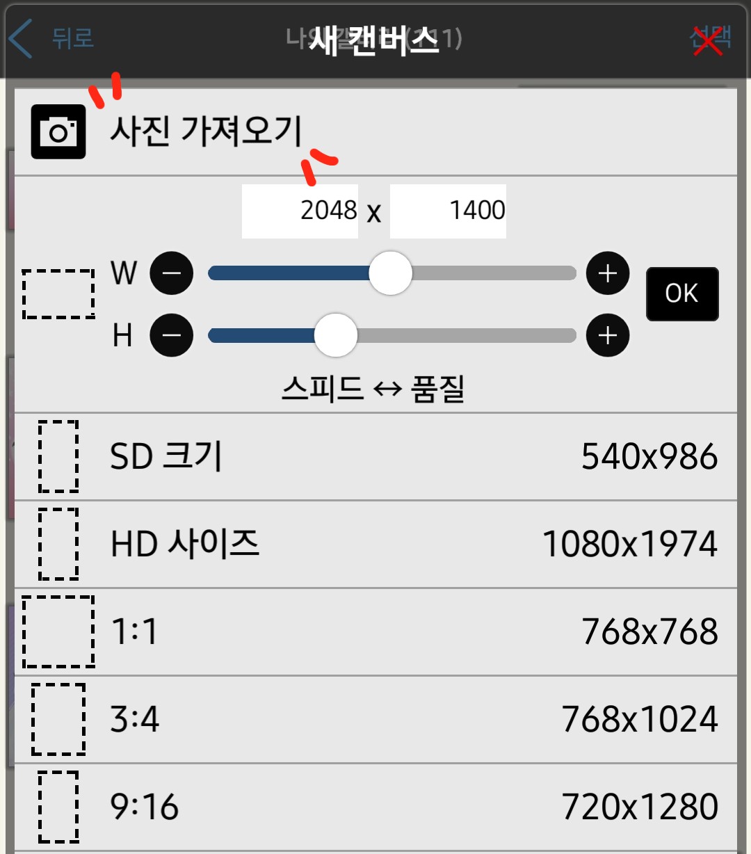
Select the mockup data you saved earlier
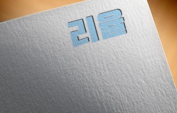
I'll make it like this!
If you've come this far, it's just the beginning, so be nervous.
3
Insert text
I'll put the text in now
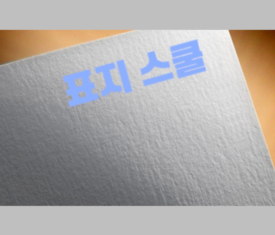
I am Cover SchoolI'll try putting in some text!
[ Brush Window - Text ]
(🌚 Lesson 2: Understanding Ibis Features (1) Reference)
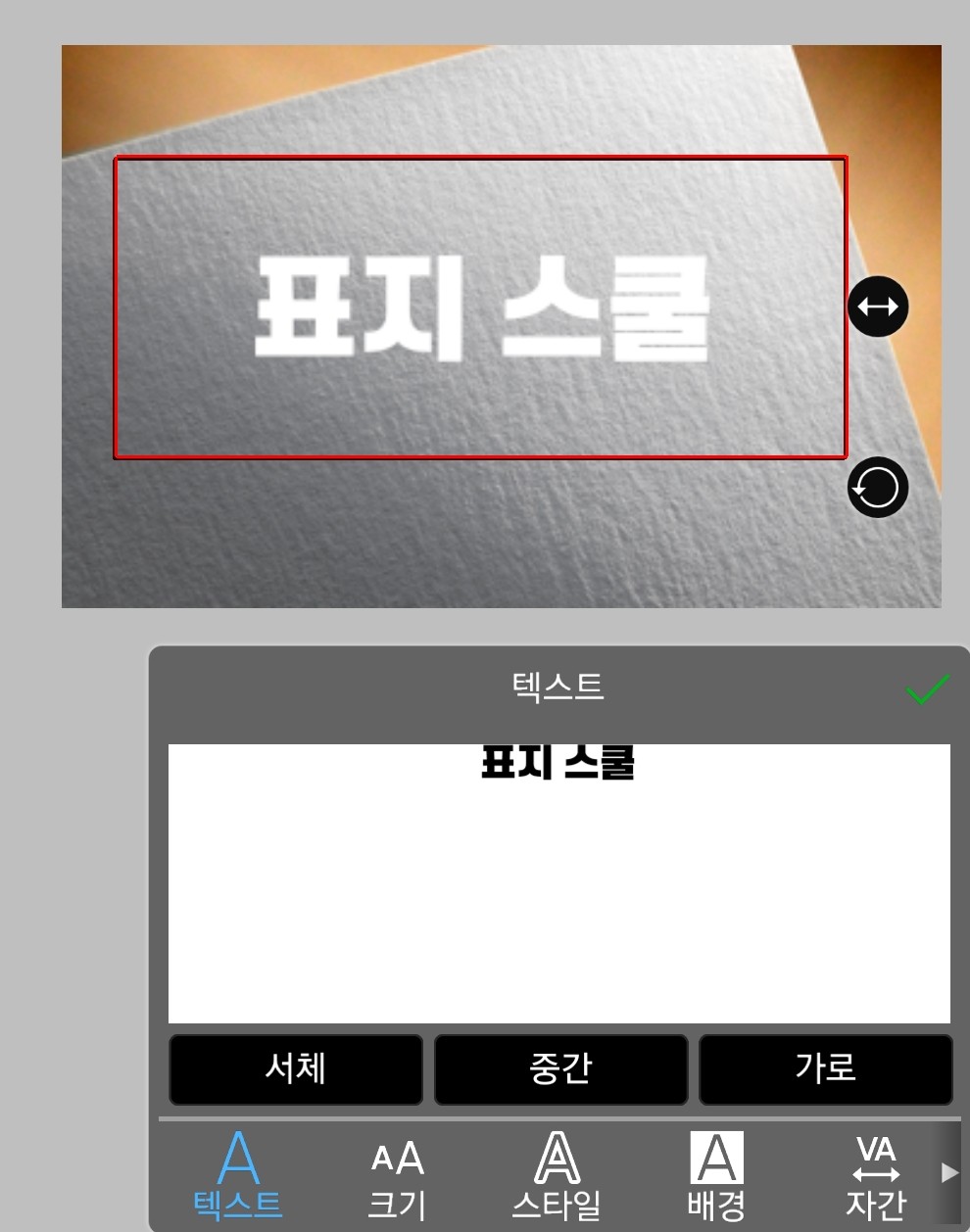
Adjust the size as you like
The font is just what you want!
(Using DX Bulletproof Gothic)
Let's use the one on the bottom right to slightly change direction.
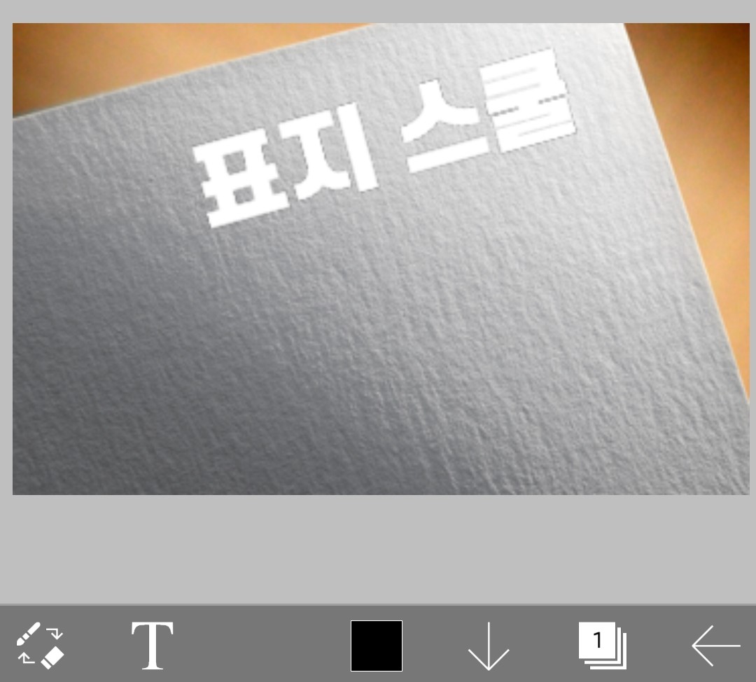
like this!
Now let's add color to the text.
If you find it bothersome, just stick with a single color.
(No white or black used)
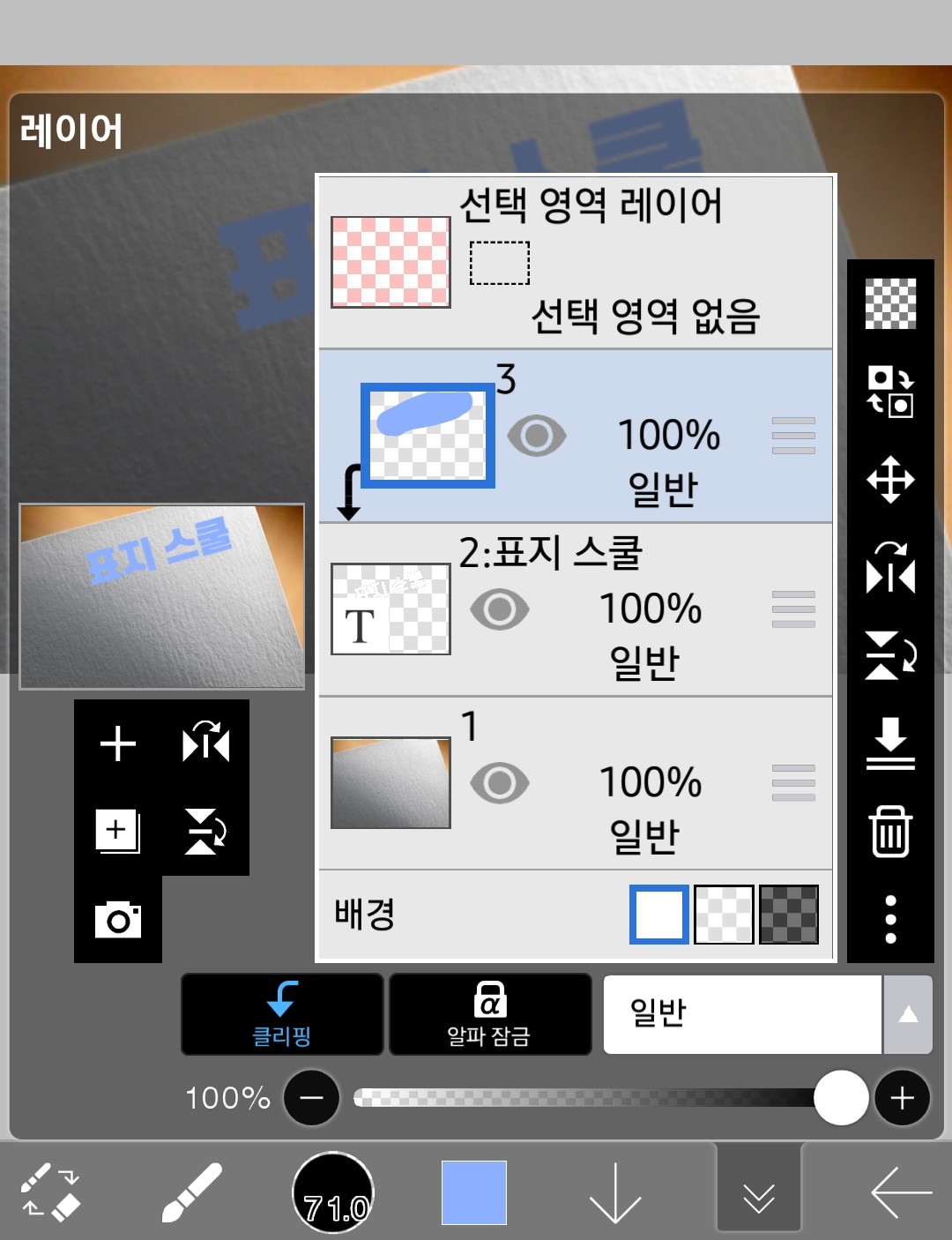
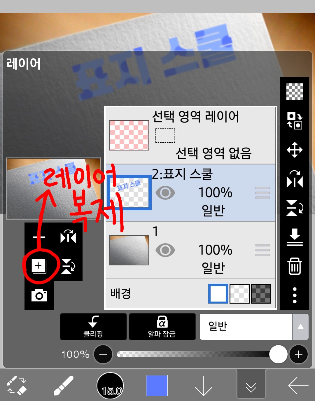
To do that, add one more layer!
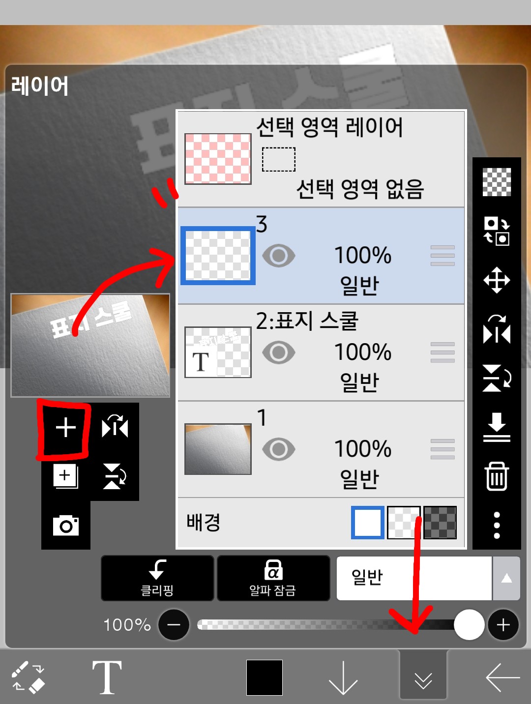
Click on the layer window at the bottom right to open it
If you click on (➕) on the left, it will look like the one shown at the top.
3A layer that says " is added!
I'm going to add color to layer 3 there.
Because the cover of the cover school is sky blue
I'll try adding the color sky blue
Before that
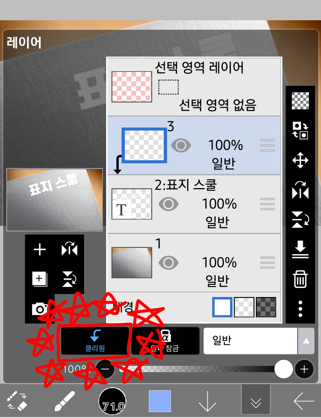
clipLet's get started!
If you color it in this clipping state,
The layer window looks like this
The canvas looks like this
But if you just do it like that, the writing will be a bit boring
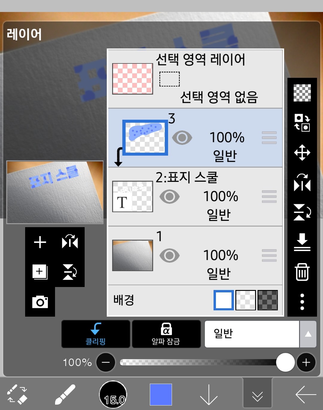
Add a polka dot pattern.
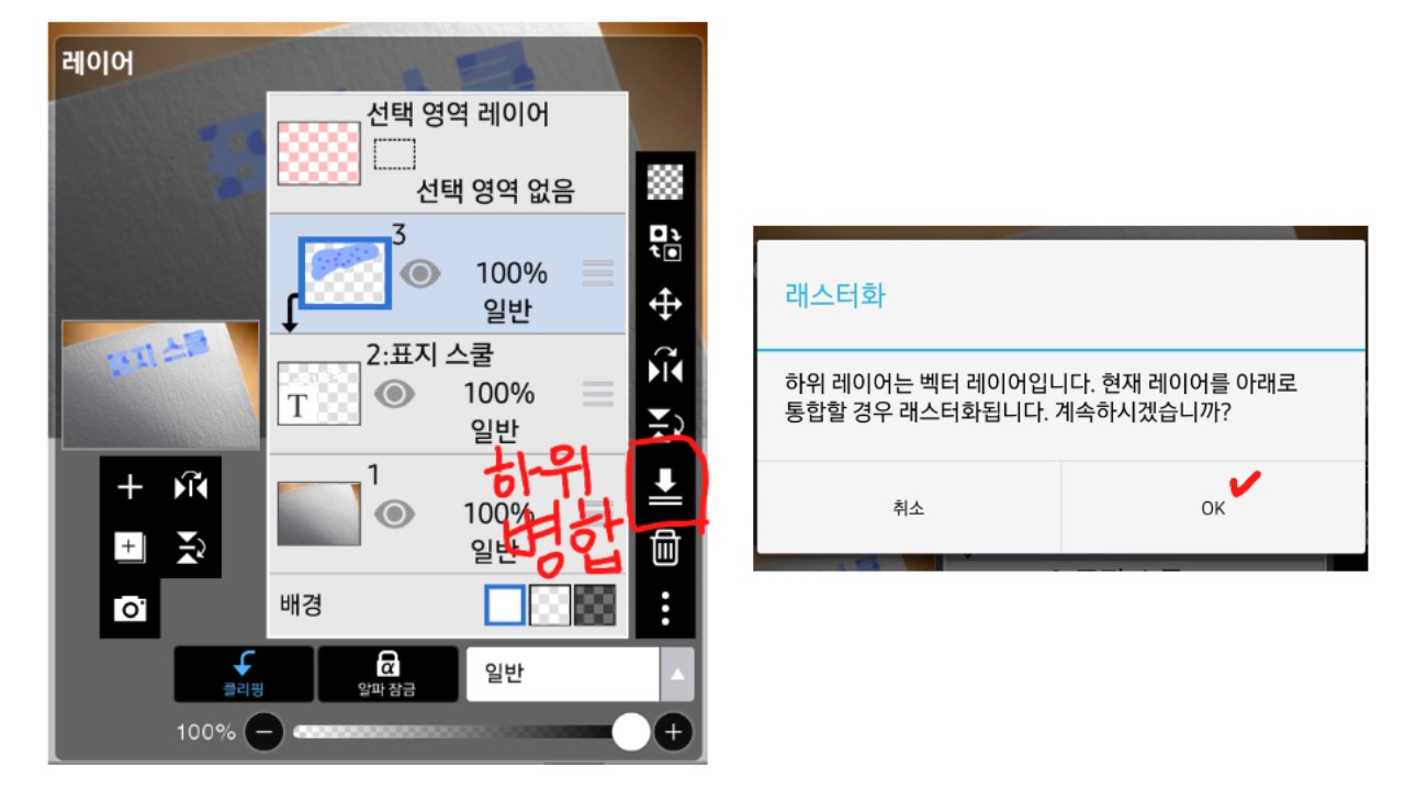
>>Click on the arrow-shaped sub-merge button in the clipped state<<
Then, it says rasterization like the second picture.
You have to press OK
4
Add effects
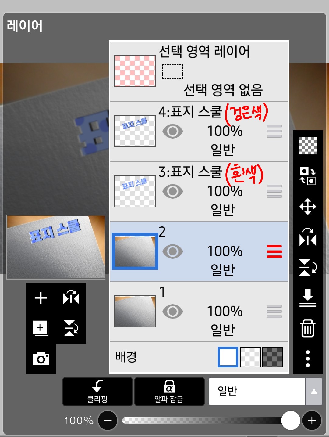
Now I'm going to click on that and create two layers each.
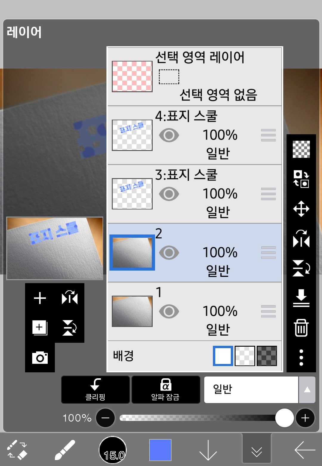
With a total of 4 layers like this, you are 70 percent done.
Now comes the really important part
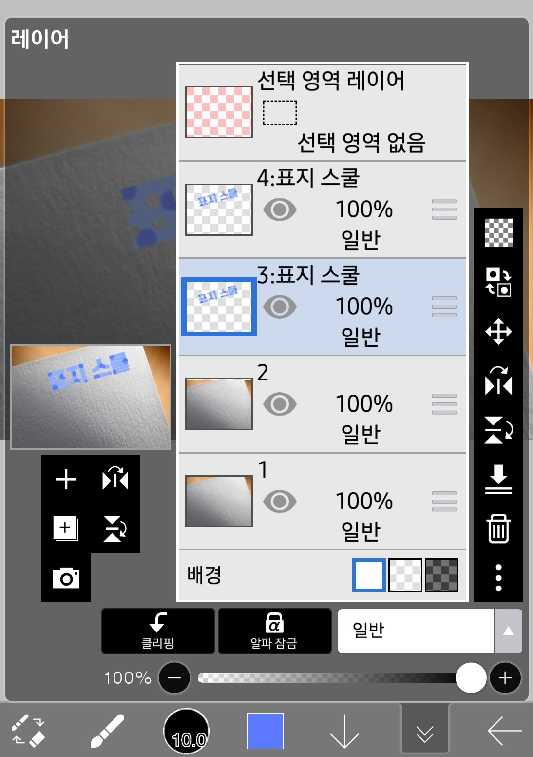
After selecting layer 3, go to the filter window
style ofDrop shadowI'm going to use the effect
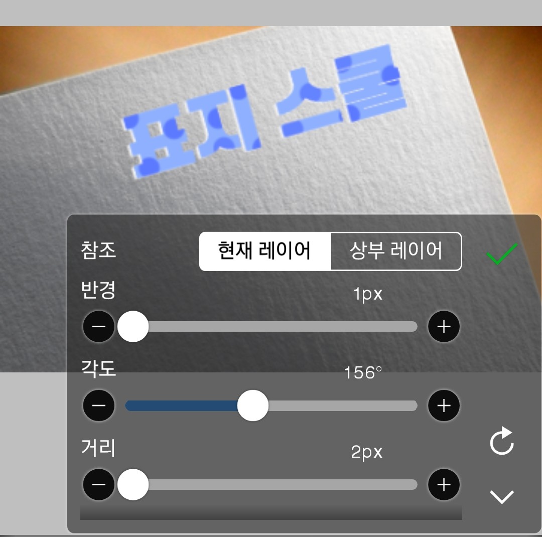
White comes out on the leftanglePlease adjust it
After completing, click the check mark
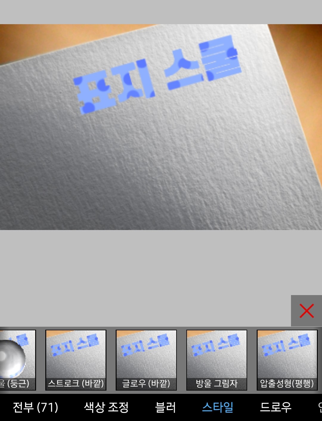
After entering layer 4, go back to the filter window and select Style - Drop Shadow
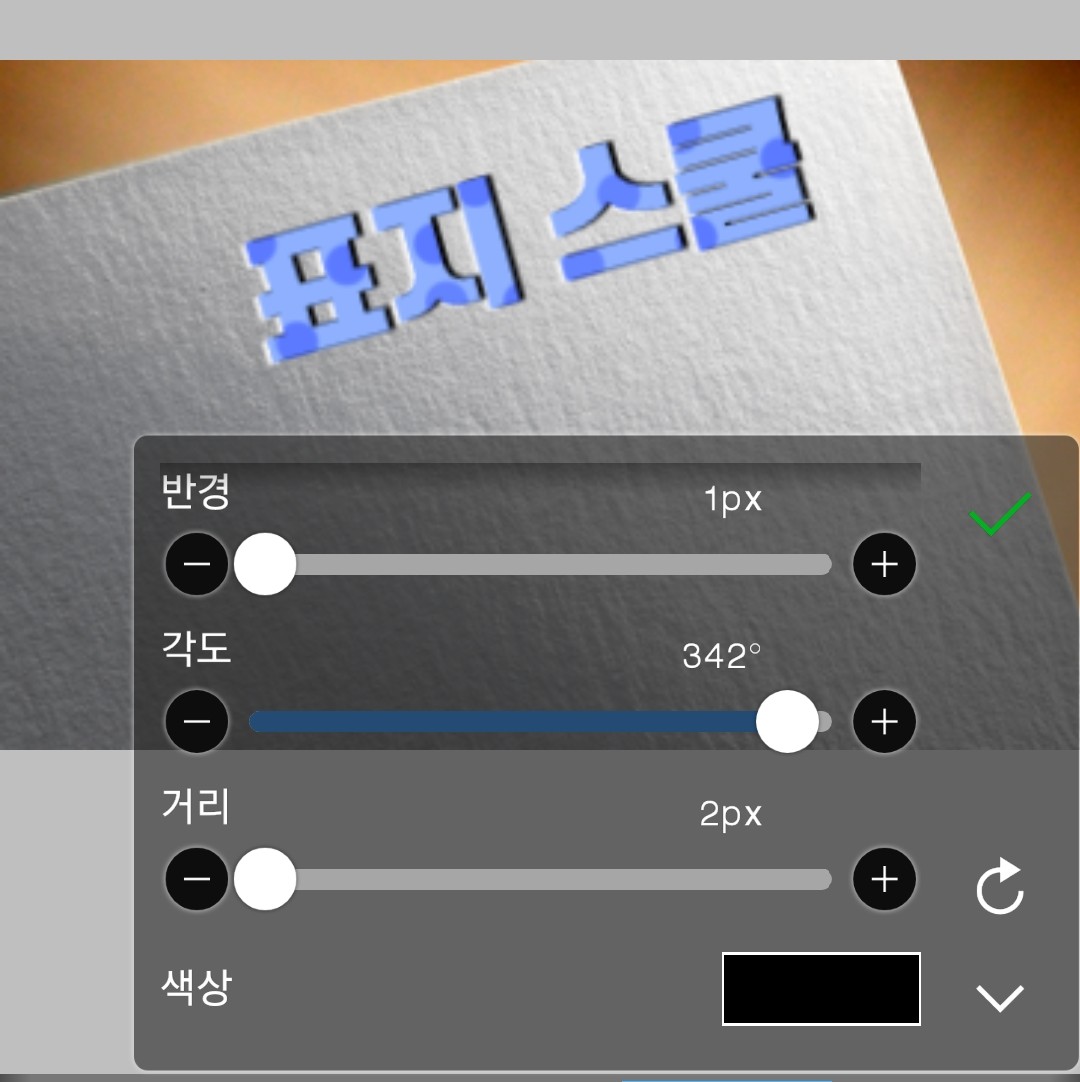
This is layer 4 and I want the black to be on the right.
Then, there is a white shadow on layer 3
Layer 4 will have a black shadow
Now, take the three lines next to layer 2
I'll make the letters centered.
Now clip layer 4
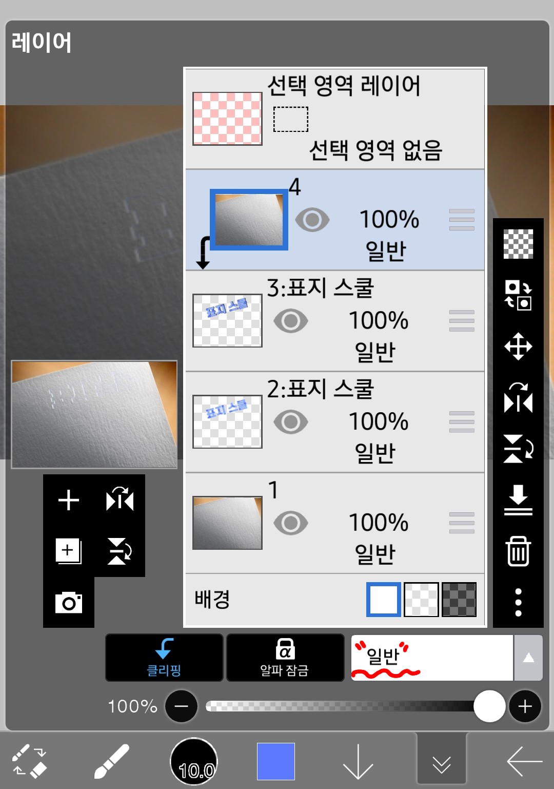
If you press clipping in number 4, it will look like this
It's normal to only see a little white color.
Now what you see belowcommonPress
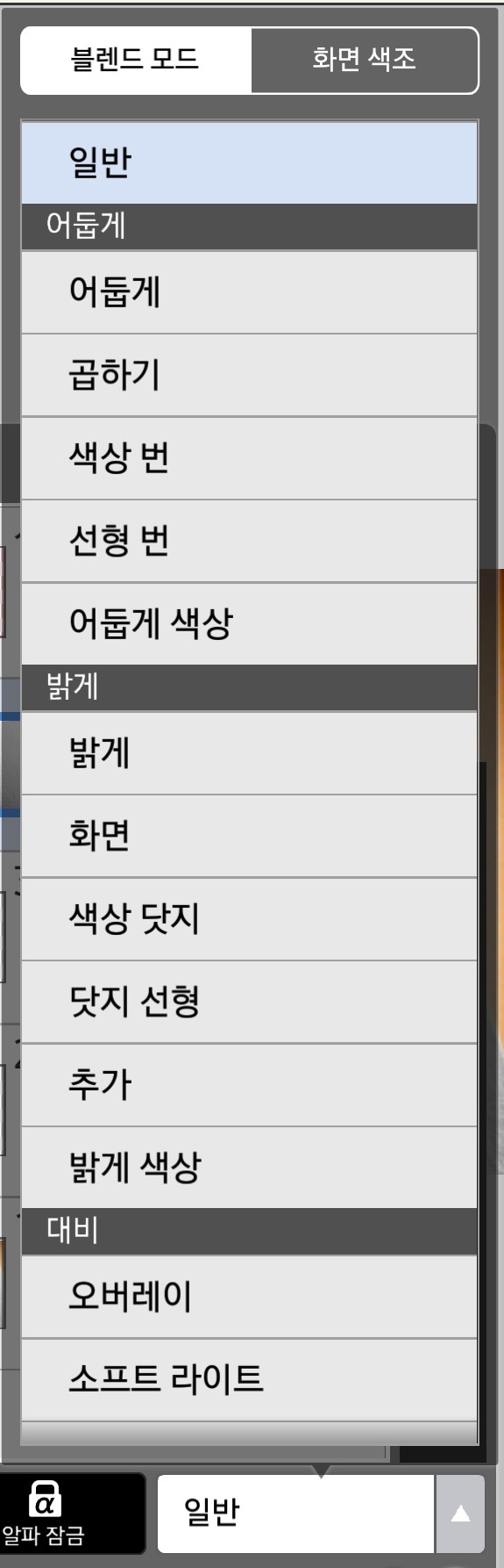
Yorokorom... Windows are popping up one after another, and among them
multiply
If you press it

end!!!!!!!!!
No... it took me a day to make this
But when I read it, it took me a minute...
Even though it looks complicated, it's not that difficult.
Everyone challenge...?
If you have any questions, please leave a comment. If you want me to teach you something, please leave a comment!